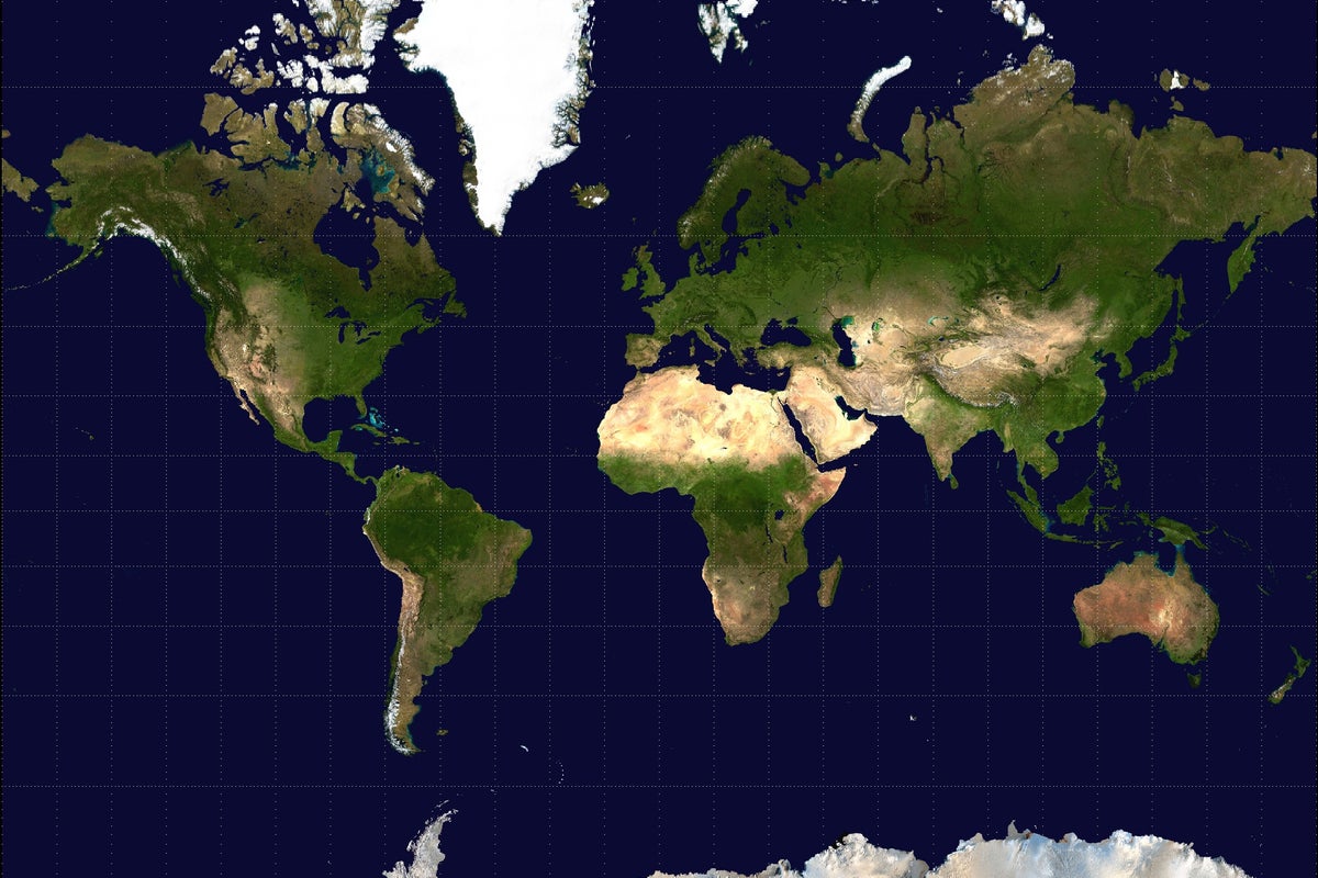
Every few years, the internet loses its collective mind over a map. Some viral graphic surfaces, usually showing Africa swallowing North America and Europe whole, and the comment sections erupt into righteous indignation. People scream about colonial bias, Eurocentric cartography, and the grand geographical conspiracy designed to make northern hemisphere powers look like giants while shunting the global south into cartographic insignificance.
The UN just adopted a new world map, or so the internet claims every time this particular cycle resets.
Here is the inconvenient truth. The UN did not discover a magic paper that solves the laws of geometry. And your outrage over the Mercator projection is based on a fundamental misunderstanding of what a map is actually supposed to do.
Let us get one thing straight. You cannot flatten a sphere into a two-dimensional rectangle without stretching something. It is a mathematical impossibility. If you want accurate landmass sizes, you sacrifice shape. If you want accurate shapes and angles for navigation, you sacrifice size. Cartographers have known this since Gerhard Mercator drew his famous grid in 1569. He did not build it to stroke European egos. He built it so sailors could draw a straight line on a flat chart and sail their ships without crashing into rocks.
Yet, digital activists treat a navigation tool from the sixteenth century like a political manifesto. They demand a "true size" map as if correcting the projection will somehow redistribute geopolitical power or alter actual geography.
The Fallacy of the Flat Surface
Let us look at the mechanics. The Mercator projection distorts areas near the poles. Greenland looks roughly the size of Africa. On paper, it is a glaring mismatch. In reality, Africa is fourteen times larger than Greenland.
When people discover this, they feel cheated. They assume malicious intent. But map projections are engineering compromises, not moral documents.
Every single flat map is a distortion. The Gall-Peters projection, often hauled out as the moral savior of cartography because it preserves relative area sizes, turns the continents into elongated, stretched-out rags that look like they were melted in a microwave. Navigating using Gall-Peters would run cargo ships aground within an hour.
Imagine a scenario where you hand a basketball to a child and tell them to peel it and press the orange skin flat onto a wooden table without tearing or stretching it. They cannot do it. You cannot do it. Mathematics forbids it. The Gauss-Bonnet theorem proved centuries ago that intrinsic curvature cannot be flattened without distortion.
When internet commentators demand a world map that shows the "true size" of all countries without distortion, they are asking for a physical impossibility. They want a spherical representation printed on a flat screen. It is the geographic equivalent of asking for wireless electricity that travels through pure atmosphere without losing a single watt.
Why the Outrage Industry Loves Cartography
Why does this myth persist? Because outrage loves simplicity.
Blaming a sixteenth-century map projection for modern global inequality is a lot easier than engaging with actual supply chains, trade agreements, and political corruption. It provides a clean narrative. Bad Europeans drew big maps to make themselves look powerful.
I have watched policy wonks and media strategists spend weeks debating the optics of map proportions while completely ignoring the actual infrastructural deficits of the regions they claim to defend. Nobody ever pulled a village out of poverty by switching their browser from Google Maps to a Peter-Projection PDF.
The obsession with map equity is a classic symptom of performative awareness. It costs nothing. It requires no technical knowledge. You share an image of Africa scaled to the size of a continent-eating monster, type a caption about colonial cartography, and collect your dopamine hits.
Meanwhile, actual geospatial engineers deal with the messy reality of satellite data, coordinate reference systems, and spatial analysis. They do not care about your feelings on Greenland. They care whether their GPS coordinates are accurate within a centimeter when deploying disaster relief supplies.
The Practical Reality of Spatial Data
If you want to understand how the world actually works, abandon the two-dimensional paper map entirely. We live in an era of digital globes and geographic information systems.
When you use modern mapping software, the underlying data is stored as a three-dimensional model of the earth, an ellipsoid known as WGS 84. The flat projection you see on your monitor is just a rendering trick executed on the fly. You can spin the globe, change projections with a click, and view the earth from any angle you choose.
The idea that the global community is locked into a single, oppressive worldview enforced by Mercator is a ghost story. Modern navigation, aviation, and logistics dropped dogmatic adherence to single projections decades ago.
Yet the myth refuses to die. Every time a headline pops up claiming a new international body has ratified a revolutionary world map, the literacy rates of the internet drop ten points.
Stop looking for political malice where basic geometry is the sole culprit. Stop treating an artifact designed for sixteenth-century sailors as a referendum on your political morality.
The earth is round. Your flat screen is a lie. And no amount of indignant sharing on social media is going to change the rules of calculus.