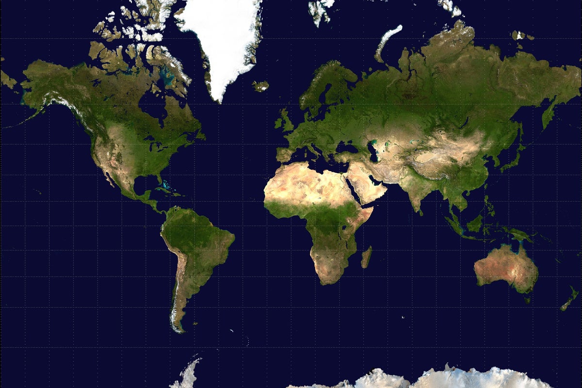
Every few months, the internet reinvents outrage. Someone discovers that Greenland looks roughly the size of Africa on a standard classroom map, pulls out an actual globe, and screams about cartographic imperialism. Headlines scream that the United Nations is about to vote on a new world map to fix the distortion, as if global coordinates are software updates we can just patch over a weekend.
It is lazy outrage built on a fundamental misunderstanding of geometry.
The Cartographic Reality Check
Spheres do not flatten into rectangles without distortion. This is not a political conspiracy; it is a mathematical inevitability taught in high school trigonometry. You cannot peel an orange and lay the skin flat on a table without tearing or stretching it.
The Mercator projection, created by Gerardus Mercator in 1569, was never designed to show relative size. It was designed for navigation. Straight lines on a Mercator map are lines of constant compass bearing, known as rhumb lines. If you are sailing a wooden galleon across the Atlantic in the sixteenth century, a map that distorts Greenland into a bloated giant keeps you alive. If you use a Gall-Peters projection—the darling of map-equality activists—to navigate, you will crash your ship into a reef because straight lines do not represent true compass directions.
The Trap of Equal-Area Fixation
Activists pushing for equal-area projections want you to believe that shifting away from Mercator cures geopolitical inequality. This is magical thinking. Greenland looking smaller on a map does not alter its actual landmass, nor does it redistribute its gross domestic product, population, or geopolitical leverage.
Maps are tools. A wrench is not evil because it cannot drive a nail. Mercator is a navigation tool. Robinson and Winkel Tripel are compromise tools meant for visual balance. Equal-area maps are statistical tools for comparing spatial distribution. Treating a map like a moral ballot paper means you do not understand what a map is supposed to do.
Why the UN Vote Myth Persists
The perennial rumor that the United Nations is voting to replace standard world maps is a ghost story for geography nerds. The UN uses standard cartographic standards for its cartographic section, yes, but it does not mandate a single official projection for global education. The body has bigger crises to manage than whether school boards in Ohio prefer Eckert IV over Robinson.
When people demand a new map to show the true size of all countries, they are treating a visual medium like a PR campaign. They want proportional representation on paper because actual economic and political redistribution is hard. Changing the background graphic feels like a revolution without requiring any policy sacrifice.
What You Should Do Instead
Stop looking at flat maps for spatial truth. If you want to understand geography, spin a globe. Better yet, look at a digital globe software where spatial distortion disappears entirely through dynamic rendering.
Cartography solved the flat-earth representation problem centuries ago by accepting that every projection is a compromise. Pick the tool built for the job at hand. Stop asking maps to absolve historical guilt, and start using them to figure out where you are actually trying to go.